Typography is an art form that often goes unnoticed, yet it plays a pivotal role in conveying messages, evoking emotions, and setting the tone for any design.
Canva, a leading graphic design platform, offers a plethora of font choices, each with its unique charm and character. But with so many options, how do you choose the best? Let’s embark on a journey to discover the top 10 Canva fonts that have won the hearts of designers worldwide.
10. Playfair Display
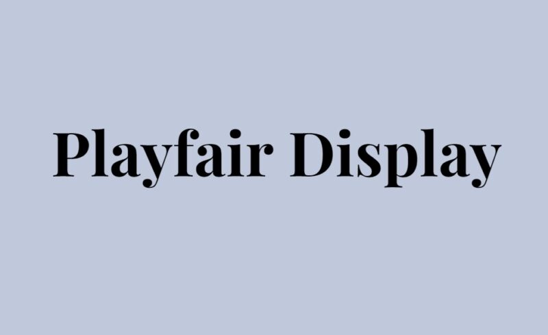
Elegance Meets Modernity
Playfair Display is a revival of the classic transitional typefaces from the 18th century. With its high contrast and distinctive style, it’s perfect for headlines and titles. The font draws inspiration from the works of type designer John Baskerville and reflects the era’s neoclassical spirit. Its tall ascenders and descenders give it a touch of sophistication, making it a favorite for luxury brands and upscale publications.
9. Raleway
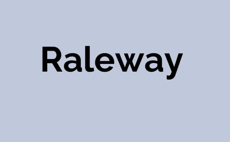
Minimalism at Its Finest
Raleway is a sans-serif typeface that exudes simplicity and modernity. Its clean lines and geometric form make it versatile for both headers and body text. Initially designed as a single thin weight, it has now expanded into a full-fledged font family. Raleway’s airy feel and neutral design make it a go-to choice for contemporary designs, especially for tech companies and startups.
8. Montserrat
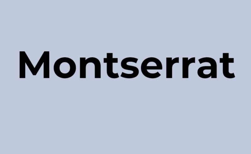
The Urban Touch
Drawing inspiration from the old posters and signs of the traditional Montserrat neighborhood in Buenos Aires, this font brings a touch of urban flair to any design. Its rounded letters and open spacing make it highly readable, suitable for both digital and print mediums. Montserrat has become a staple for many designers, thanks to its versatility and friendly appearance.
7. Lato
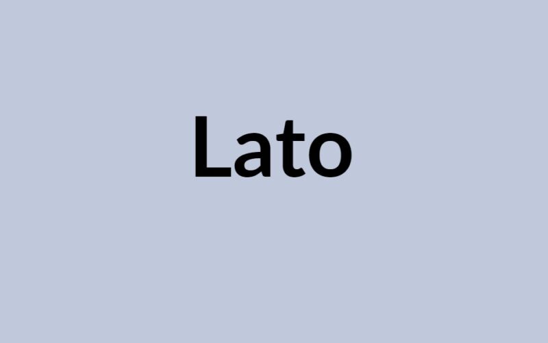
Harmony in Design
Lato, which means “summer” in Polish, is a sans-serif typeface that strikes a balance between serious and friendly. Designed by Łukasz Dziedzic, it offers a blend of classical proportions and contemporary aesthetics. Its semi-rounded details give it warmth, while the strong structure ensures stability and reliability. Lato is perfect for corporate designs, where you want to convey trust without being too rigid.
6. Josefin Sans
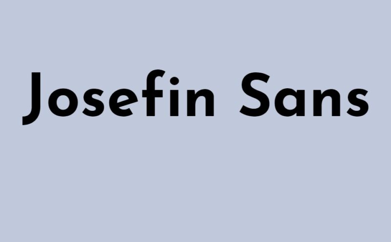
Vintage Yet Fresh
Josefin Sans is a geometric sans-serif that takes cues from vintage designs of the 1920s and 30s. Its thin letterforms and elongated shapes give it a unique character, reminiscent of the Art Deco era. However, its modern twists ensure it doesn’t feel outdated. If you’re looking to add a touch of retro charm with a fresh spin, Josefin Sans is your pick.
5. Roboto
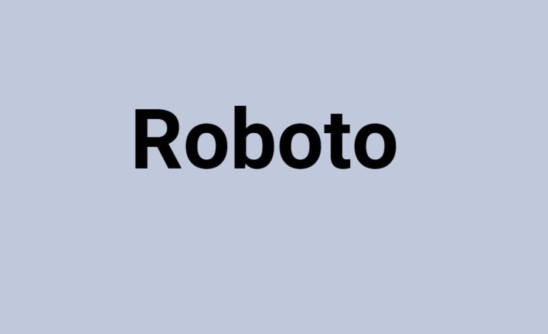
The Digital Age Typeface
Roboto, designed by Christian Robertson for Google, is a neo-grotesque sans-serif that was created with mobile screens in mind. Its open curves and fluid strokes ensure readability on small devices. The font seamlessly blends geometric shapes with friendly open curves, making it fit for both tech-related designs and general-purpose use. It’s no wonder Roboto is a favorite among app developers and web designers.
4. Oswald
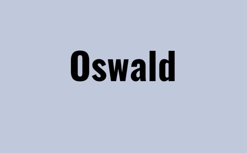
Reviving the Classics
Oswald is a reimagining of the classic “Alternate Gothic” sans-serif typefaces. Its condensed form makes it perfect for headlines, especially in newspapers and websites. The font has been optimized for digital use, ensuring it displays well on various screen sizes. If you’re looking for a bold statement with a nod to the past, Oswald is the way to go.
3. Pacifico
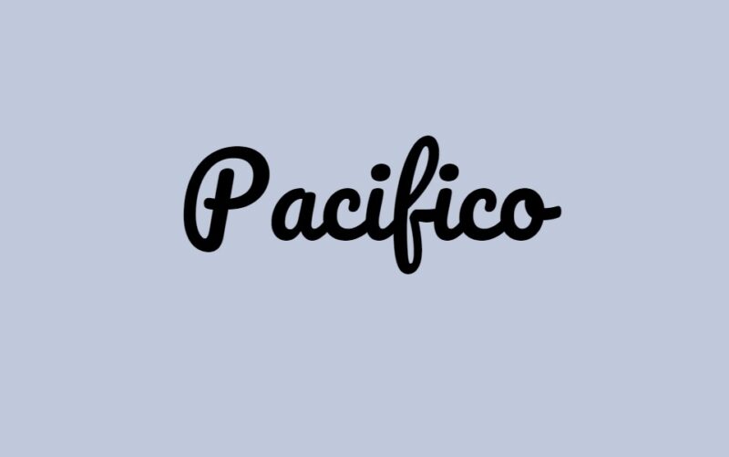
Handwritten Delight
Pacifico brings the charm of hand-lettered brush scripts to your designs. Its flowing and playful curves are reminiscent of the 1950s American surf culture. This font is perfect for designs that need a personal touch, be it wedding invitations, logos, or greeting cards. Pacifico adds a dash of fun and whimsy, ensuring your design stands out.
2. Archivo Narrow
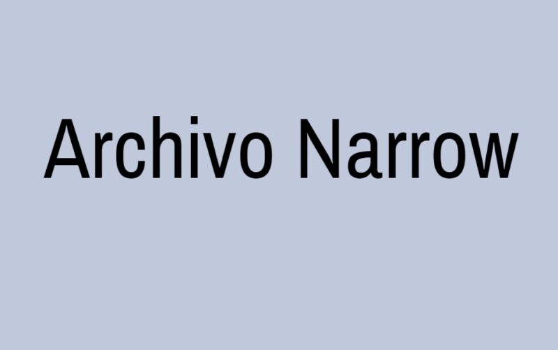
Precision Meets Elegance
Archivo Narrow was designed for use in print and digital mediums, with a particular focus on legibility in small text sizes. Its narrow proportions and tight spacing make it ideal for UI design, labels, and captions. The font’s elegant yet functional design ensures that content is presented clearly without compromising on aesthetics.
1. Open Sans

The Universal Choice
Topping our list is Open Sans, a humanist sans-serif designed by Steve Matteson. Its open design, clarity, and neutral appearance make it suitable for a wide range of applications. Whether it’s a website, mobile app, or print material, Open Sans delivers optimal readability and a professional look.
Its wide range of weights and styles, from light to extra bold, offers designers flexibility and variety. It’s no surprise that Open Sans has become one of the most popular fonts in the digital world.
FAQs
How often does Canva update its font library?
Canva regularly updates its font library to include new and trending typefaces. While there isn’t a fixed schedule, users can expect to see fresh additions and updates every few months.
Can I upload my own fonts to Canva?
Yes, Canva allows users with a Pro subscription to upload their own fonts. This feature is especially useful for brands that have a specific typeface associated with their identity.
Are there any licensing restrictions when using Canva’s fonts for commercial purposes?
Most of the fonts available on Canva can be used for both personal and commercial purposes. However, it’s always a good practice to check the specific licensing terms for each font, especially if you plan to use it for commercial projects.
How does Canva ensure the readability of its fonts across different devices and platforms?
Canva’s font selection is optimized for digital use. The platform ensures that the fonts display well across various screen sizes and resolutions. Additionally, Canva provides guidelines and previews to help users choose fonts that are legible and aesthetically pleasing on any device.
Are there any tools within Canva to help users pair fonts effectively?
Yes, Canva offers a range of design templates and suggestions that showcase effective font pairings. These templates can serve as inspiration for users, helping them combine fonts in a way that’s both visually appealing and coherent.
Can I use Canva fonts outside of the platform, like in other design software or word processors?
While Canva fonts are primarily meant for use within the platform, some of them might be available for external use, depending on their licensing terms. If you have a specific font in mind, it’s best to check its licensing or look for it on font repositories to download and use externally.
Final Verdict
Typography is more than just letters on a page; it’s an essential tool for communication and expression. The fonts you choose can elevate your design, convey your message, and resonate with your audience. Canva’s vast font library offers something for everyone, but the ten fonts listed above have proven their worth time and again. Whether you’re a seasoned designer or just starting out, these fonts are sure to enhance your creations. Happy designing!